UI Terminology
A glossary for the region names used in the Overview layer (workspaceView = 'overview', current branch: demo/single-view-simplified). Numbers on the screenshot below are keyed to the table underneath it, so a region name always points at the pixels it describes.
Why this exists
"Component", "panel", "view", "element" get used interchangeably in conversation but mean different things. This page fixes the vocabulary so PRs, issue reports, and thesis writing about this UI can reference a region unambiguously.
Annotated screenshot
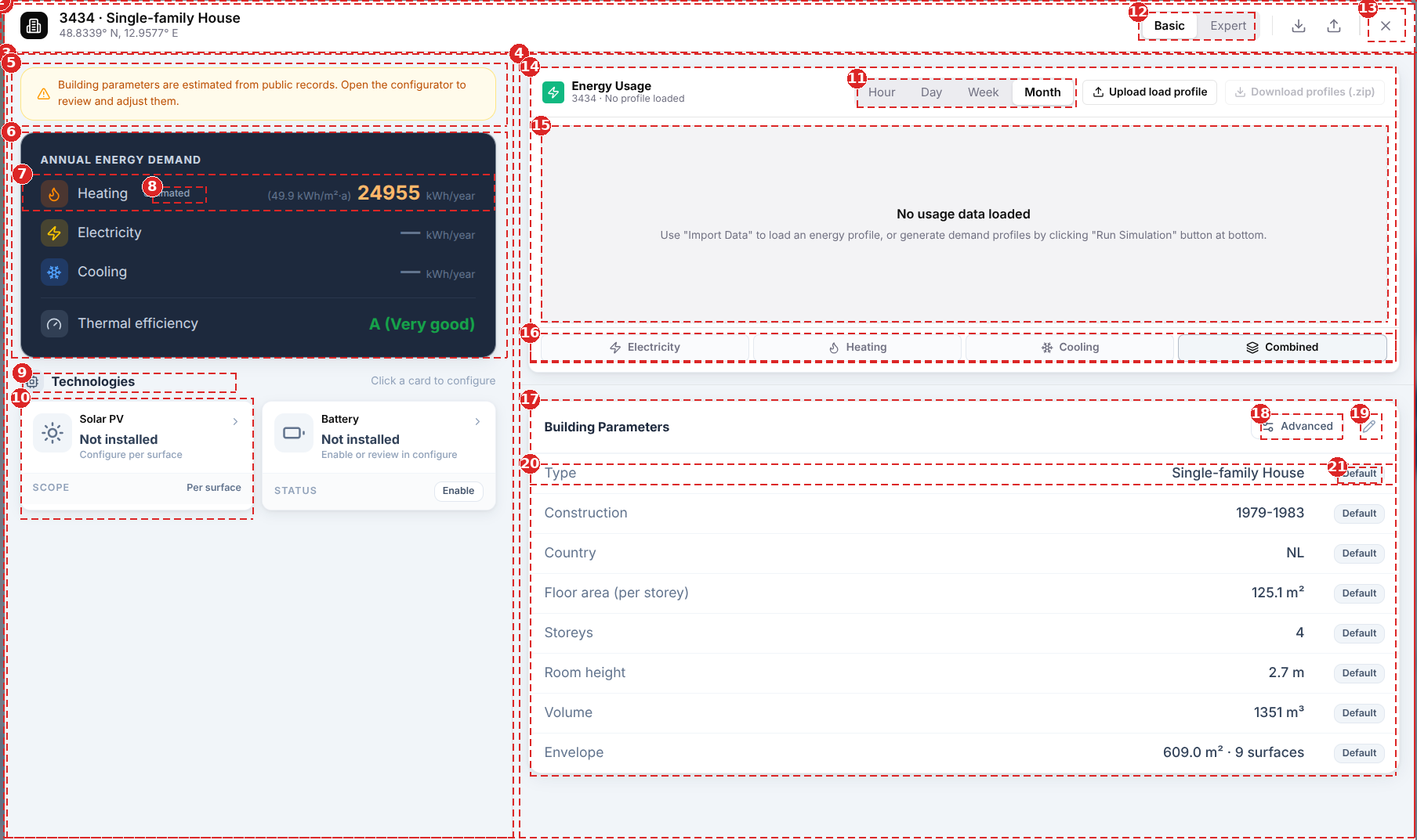
The outermost dashed box (barely visible at the image edge) is region 1, the panel itself — the whole screenshot.
Glossary
| # | Term | Definition | Use it when | Also implemented in |
|---|---|---|---|---|
| 1 | Panel | Self-contained surface with its own header, hosting a whole workflow | Grouping a header and multiple columns as one persistent visual unit | BuildingConfigurator.tsx root .cfg-panel div |
| 2 | Header | Fixed top strip: identity, mode switch, toolbar actions | The panel needs a persistent identity + global actions row above the content | BuildingConfigurator.tsx |
| 3 | Aside (left column) | A column carrying glance-only summary/status, secondary to the main working area | The column's job is "at-a-glance", not the primary task | BuildingSnapshotAside.tsx |
| 4 | Column (right column) | Vertical layout region inside a panel, independently scrollable | Splitting a workspace into regions that scroll or resize independently | EnergyEnvelopeColumn.tsx |
| 5 | Alert / banner / notice | Full-width coloured strip with icon, unmissable | Surfacing a warning/info the user must see before acting | BuildingSnapshotAside.tsx |
| 6 | Card | Bounded surface with its own border + shadow, holds one topic | Content is a distinct topic that should read as liftable/standalone | Energy hero card |
| 7 | Row / stat row | One icon + label + value line inside a card | Repeating a label-value pair | BuildingSnapshotAside.tsx |
| 8 | Badge / pill / tag | Small rounded label attached to a value, states its status or provenance | Annotating a value without a separate column or row | SourceTag ("estimated") |
| 9 | Section | Grouped content under a heading, no extra card chrome of its own | You need a heading over content that's already boxed, avoiding card-in-card nesting | "Technologies" heading |
| 10 | Card (tile variant) | A selectable card — clickable, has its own status row | Same as #6, plus the card itself is the click target | Solar PV / Battery tech cards |
| 11, 12 | Segmented control | Filled pill, multi-option, mutually exclusive, switches instantly | Switching a display mode or resolution — not navigating to different content | SegmentedControl (shared/ui.tsx) — reused for both #11 (chart resolution) and #12 (Basic/Expert) |
| 13 | Icon button | Small square button, icon only, tooltip carries the label | A toolbar action with limited space and an unambiguous icon | HeaderBtn |
| 14 | Card (widget variant) | A card whose body is a data visualisation rather than a table | Same as #6, content is a chart/graph instead of rows | LoadProfileViewer.tsx |
| 15 | Empty state | Placeholder inside a card's content area when there's no data yet | The content area normally holds data but currently has none | "No usage data loaded" |
| 16 | Toggle button group / pill strip | Full-width row of equal buttons, one active, filters a sibling area | Filtering the content of a sibling area (the chart), not switching the whole view | Electricity/Heating/Cooling/Combined strip |
| 17 | Card | Same as #6 | — | BuildingDetailsCard.tsx |
| 18 | Labelled icon button | Icon button with a visible text label, not tooltip-only | The action is used often enough to deserve a permanent label, not just an icon | "Advanced" button |
| 19 | Icon button | Same as #13 | — | Edit (pencil) toggle |
| 20 | Row | Same as #7, but as a table <tr> (label / value / status) instead of a flex row |
The repeating unit is naturally tabular (fixed columns) | Property table row |
| 21 | Badge | Same as #8 | — | SnapshotStatusBadge ("Default") |
Not visible in this screenshot
Modal / Dialog (ElementConfiguratorModal, built on @radix-ui/react-dialog) and menu-bar tabs (Parameters/Envelope plain underline tabs on card #17) only appear once the user opens an editor or switches to Expert mode — neither is on screen in this Basic-mode, no-editor-open capture. Overlay/backdrop — the dimmed, blurred layer the whole panel floats on — is also cropped out; it's the page behind the panel, not the panel itself.
Naming rules already encoded in the code
When to reach for which control
- Segmented control for a real mode switch (Basic/Expert, chart resolution) — filled pill, feels like flipping a toggle.
- Menu-bar tabs (plain underline buttons) when two labels swap the entire body of one card for another (Parameters ↔ Envelope) — see the comment at
BuildingDetailsCard.tsx:66. - Card whenever content should be liftable as its own visual block (own border + shadow). Section when you only need a heading over content that's already boxed — avoids nested card-in-card chrome (
BuildingSnapshotAside.tsx:119). - Modal (
ElementConfiguratorModal) only for exclusive single-topic editing. Panel (BuildingConfiguratorroot) for the always-visible dashboard everything else sits inside.
This branch's Overview layer replaced the older split of ElementCompositionSection + TechnologiesSection as separate right-column blocks (see Architecture) with BuildingDetailsCard's Parameters/Envelope tab merge — the architecture doc's Overview diagram predates this simplification.